The Media Arts A11y Website Template is a quickstart guide to help you
make a class website which is accessible and easy to create. Although
primarily intended for teachers and educators, this template can be used
by anyone to create accessible websites.
View the template.
Introduction
The template is accompanied by this guide which explains the design and development of the website. This is intended to quickly get you up to speed on the basics of creating accessibility friendly web development, not a comprehensive guide.
This is an open-source project, and contributions are very welcome! We'd like to continue refining this template, with the hope of making the web more accessible, by making it easy to create accessible websites.
This guide can be accessed as a PDF, Google Doc, and a markdown file.
Quickstart
The template consists of a barebones website with pages for the landing pages, syllabus, assignments, resources and a FAQ. Elements such as images, embeds, tables, and others are modular, and are easy to copy and paste to other pages or your own website. This accompanying guide explains the various design and development approaches to creating this template.
Download
Download the template as a package file, clone from Github or remix a Glitch project, and replace the placeholder content with your own.
Design Approach
Web accessibility must be built into a website from the ground up. As Bruce Lawson, co-editor of the HTML 5.3 spec so elegantly phrases it, “Built-in beats bolt-on. Bigly”. It’s much easier to make a website accessible from scratch rather than adding accessibility to a pre-built website. Designing an accessible website not only makes it much easier for viewers with disabilities to view your content, but can also provide an excellent experience for able bodied viewers as a bonus.
Just as layouts, colours, typefaces, and other visual elements are intentionally chosen to make it easier to view the content on a website, designing for accessibility is no different. The efforts taken to ensure that a website is accessible is just as critical as making sure it’s responsive and looks consistent across screen sizes.
Even visual design can be used to make a webpage more accessible. Some viewers may have colour vision deficiency, dyslexia, and other difficulties in perceiving content on the page. There are some considerations that can be taken into account to ensure that the content is more accessible. Check to make sure that the images on the page are of high contrast, and are still discernible for various colour deficiencies. Typography is also a critical factor in ensuring proper readability. It's good practice to ensure that the font size is at least 12pts or 16px, and that the typeface is fairly legible. Using sans-serif typefaces which appear less crowded help–Arial, Open Sans, Verdana are safe choices. The often derided Comic Sans has great legibility for dyslexic people. Open-Dyslexic is a good, open-source alternative.
Good design is accessible.Semantic HTML
A website can be made dramatically more accessible simply by using
semantic HTML. The HTML spec has a diverse array of tags which make it
easy for browsers, screen readers, and other accessible technologies to
parse your website. These tags reinforce the semantic meaning of the
content on the website rather than to define the look of the content.
Using a <nav> tag to create a navigation bar rather
than a <div> makes it known to the browser and other
technologies that a particular block of content is used to navigate the
website. The HTML spec contains a surprisingly comprehensive list of
tags which cover a wide gamut of uses cases.
Using semantic HTML can not only make it easier for accessible technologies to understand your website, but can also make the development of the site much easier. A good way to start creating a HTML page is to use a simple tree diagram like the one below.
  main page
    ->header
      ->h1
        ->"Media Arts Website"
    ->nav
      ->ul
        ->li
          ->a
            ->"syllabus"
        ->li
          ->a
            ->"schedule"
        ->li
          ->a
            ->"assignments"
        ->li
          ->a
            ->"resources"
        ->li
          ->a
            ->"faq"
    ->main
      ->h2
        ->"Fall 2021 Creative Coding"
      ->p
        ->"CRN2032"
        ->"Professor"
      ->img (background image)
Writing pseudo-code can make it easier to structure your website and find the correct semantic tags to use. The hierarchy and order of content should be congruent between the HTML file and the final styled website rendered on the browser. Accessibility technologies will view the website through the HTML structure, not what you visually see.
It’s usually advisable to wrap your content within
<main> tag, and use hierarchical typographical tags
such as <h1> followed by <h2>,
<h3> and so on. Style text using tags such as
<strong> for bold text and
<em> for italics. Use <nav> for
the navigation, <footer>. There’s even an
<address> tag to write contact information! See the
entire list of HTML tags at this
website.
Navigation
When designing and developing your website, it’s important to keep navigation pathways in mind, for all kinds of users. Making it easier for users to get to their desired destination within your website makes for a better experience, and this should be no different when designing for accessibility. Using semantic HTML makes navigation much easier for those using accessible technologies. Semantic HTML tells these technologies the structure of your website and the hierarchy of the content which enables users to quickly sift through headings to get to the desired content.
In situations where there is a lot of content on a web page, using internal links can help users skip content to get to the bottom of the page.
  <a href="#mysketch" class="skip-link">Skip to my p5js sketch</a>
    <section id="mysketch"> //your sketch iframe comes here </section>
As you structure and design your website, think of the experience both for able bodied users and those using screen readers and other accessible technologies. Simulate or test the experience of viewing your website as you create it to ensure that the experience is as desired.
If you do come across a situation where there is no appropriate semantic HTML tag, look into the use of ARIA (Accessible Rich Internet Applications) attributes. These are attributes specifically designed for screen readers. ARIA tags will most likely be applicable for websites with dynamic content. In such a scenario, look for specific examples that fit your use case. For example, ARIA attributes are useful for form elements, such as checkboxes, text input and drop downs. Read more about ARIA at MDN Docs.
Testing and Validation
An important part of making sure a website is accessible is testing and validation. Testing is the best way to ensure that the experience of viewing a website is as intended. Although there is no substitute for real testing, there are various tools available to validate your web page and spot any glaring issues. Firefox, Safari, and Chrome all include accessibility testing and audit tools which can spot issues such as missing alt text for images, hidden content, and much more.
Beware of falling into a trap of simply being accessible ‘compliant’. The intention is not to be accessible on paper, but to ensure that the experience of viewing the website is the same, with or without assistive technologies. This can only come about by using screen readers or other assistive technologies to test the website and look for any qualitative gaps in the experience. For example, it’s not enough to only have alt-text for images. The alt-text needs to be descriptive, but not verbose. It should be contextually accurate and relevant to the rest of the content on the webpage. If you have the resources, you can also get a professional to audit the website for more thorough feedback.
To experience the webpage using screen reader, use: VoiceOver for Mac, JAWS for Chrome, or NVDA for Firefox
Maintenance
It's good practice to keep up to date with the latest happenings on the web specifications and accessible technologies. HTML5 and CSS3 introduced many improvements to make the web more accessible, and further updates will (hopefully) continue to do so. It's good to stay clued into the conversation around web accessibility, a simple web search on 'A11y' is a great way to get started. If you're having difficulty figuring out how to make certain sections of your website accessible, try searching for a solution online. Chances are, someone has probably had the same issue as you, or someone has shared a solution for it.
This template is in no way a comprehensive guide to making websites more accessible. However it is meant to be an introduction to those who may not have considered it before.
Template Breakdown
The template is modular, and sections such as paragraphs, tables, images and others can easily be moved around from page to page without any issues. This section explains certain parts of the template and why they are used.
Home Page
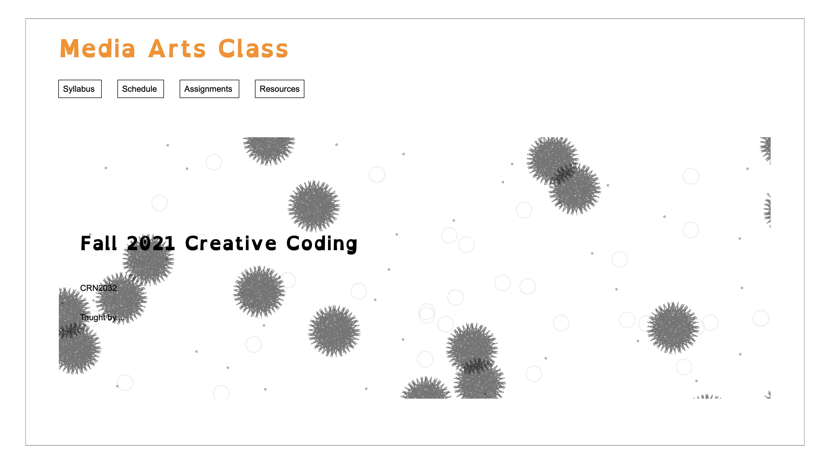
The home page of the website has a simple layout, a hero image with an
introduction to the class overlaid upon it. The hero image is a
background for the <main> tag through the CSS, hence
an ARIA attribute is used to describe the image.
  <main id="headerimage" aria-label="background image of the web page
  is an abstract image consisting of a circles of random sizes spread out
  across the page, created on p5js">
The title of the webpage uses the <h1> tag, and so the title text
on the main page uses a <h2> tag to establish a hierarchy in the
content. A well designed webpage has a well established visual and
content hierarchy, which should also be reflected in the HTML structure.
Syllabus
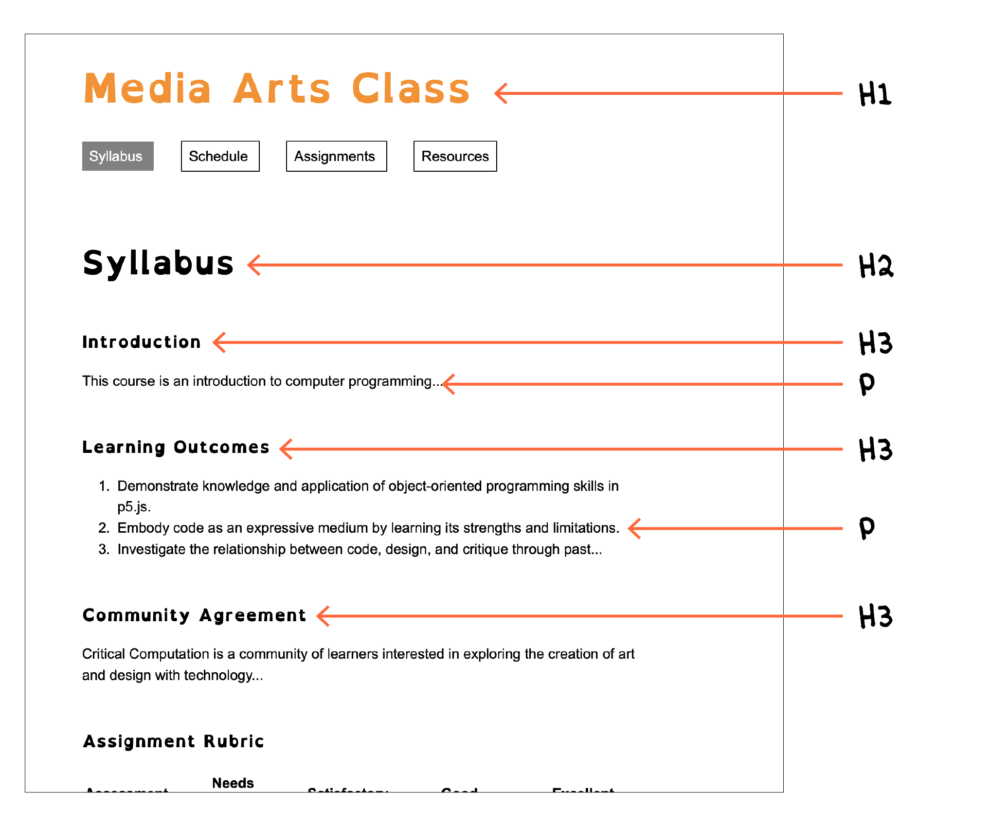
The hierarchy in text is especially visible on this page, as it contains
headers, subheaders, and paragraph text, spanning <h1>,
<h2>, <h3>, <h4>, and <p>. To see how effective
such a simple hierarchy through semantic HTML can be, try viewing the
webpage with a screen-reader and switch to a rotor view. This view lets
you navigate the webpage through the headers very quickly, without
having to go through the content in between the headers.
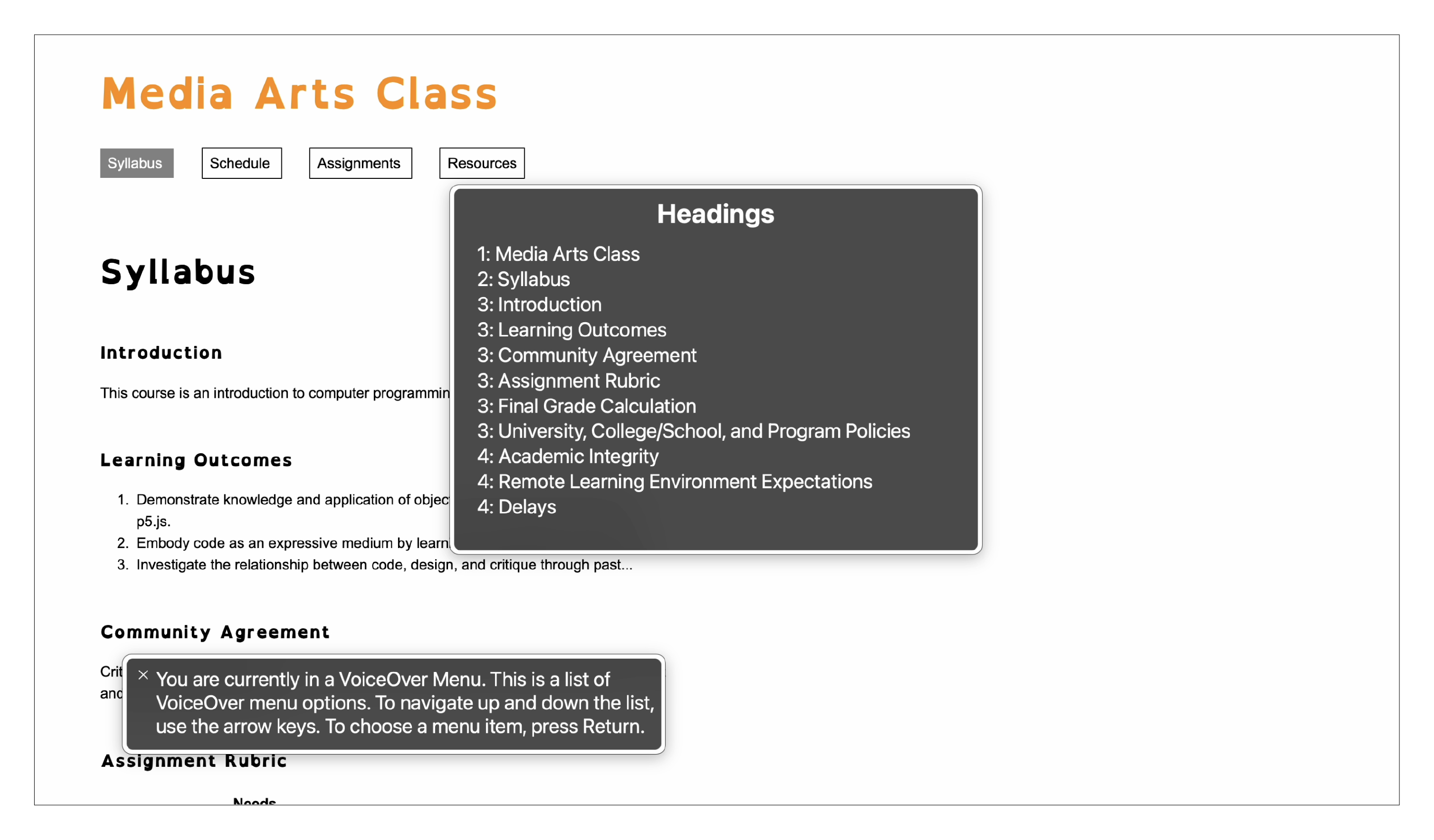
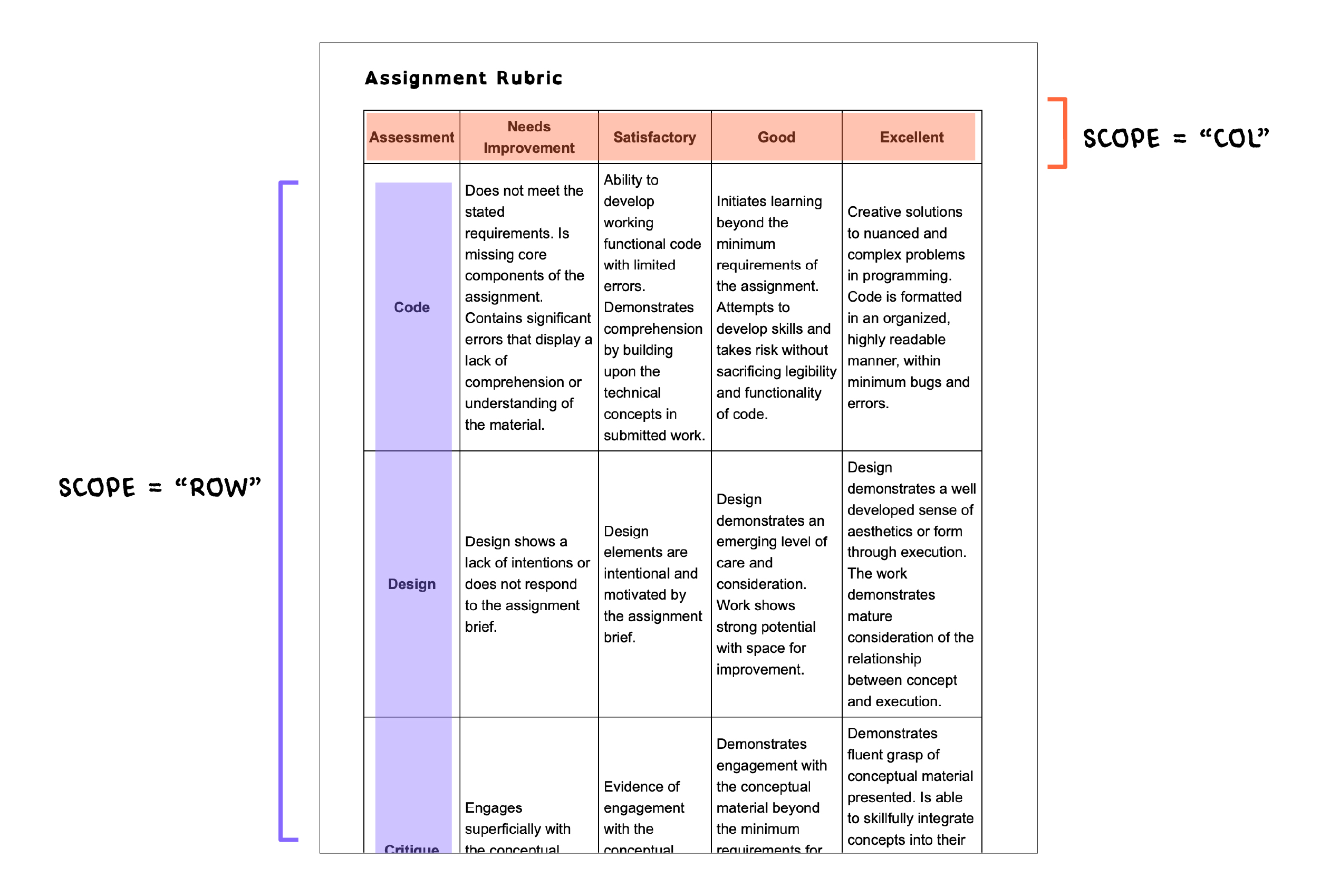
The Assignment Rubric section of this webpage shows a good way to structure content in a table format. Although it might be easier to write this content using a CSS grid, a table is just as effective and with the right attributes can semantically describe a row or a column, which makes it easier to understand the content using assistive technologies. The scope tag is important as it calls out the appropriate columns and rows which are then easily understood by the screen-reader.
    <table>
      <thead>
        <tr>
          <th>Assessment</th>
          <th scope="col">Needs Improvement</th>
          <th scope="col">Satisfactory</th>
          <th scope="col">Good</th>
          <th scope="col">Excellent</th>
        </tr>
      </thead>
      <tbody>
        <tr>
          <th scope="row">Code</th>
          <td>
            Does not meet the stated requirements. Is missing core components of
            the assignment. Contains significant errors that display a lack of
            comprehension or understanding of the material.
          </td>
          <td>
            Ability to develop working functional code with limited errors.
            Demonstrates comprehension by building upon the technical concepts
            in submitted work.
          </td>
          <td>
            Initiates learning beyond the minimum requirements of the
            assignment. Attempts to develop skills and takes risk without
            sacrificing legibility and functionality of code.
          </td>
          <td>
            Creative solutions to nuanced and complex problems in programming.
            Code is formatted in an organized, highly readable manner, within
            minimum bugs and errors.
          </td>
        </tr>
        <tr>
          <th scope="row">Design</th>
          <td>
            Design shows a lack of intentions or does not respond to the
            assignment brief.
          </td>
          <td>
            Design elements are intentional and motivated by the assignment
            brief.
          </td>
          <td>
            Design demonstrates an emerging level of care and consideration.
            Work shows strong potential with space for improvement.
          </td>
          <td>
            Design demonstrates a well developed sense of aesthetics or form
            through execution. The work demonstrates mature consideration of the
            relationship between concept and execution.
          </td>
        </tr>
        <tr>
          <th scope="row">Critique</th>
          <td>
            Engages superficially with the conceptual material delivered each
            week.
          </td>
          <td>
            Evidence of engagement with the conceptual material delivered each
            week.
          </td>
          <td>
            Demonstrates engagement with the conceptual material beyond the
            minimum requirements for the course. Shows emerging fluency in
            utilizing concepts within their own work.
          </td>
          <td>
            Demonstrates fluent grasp of conceptual material presented. Is able
            to skillfully integrate concepts into their own work. Ability to
            build compelling narratives around individual assignments.<br />
            <br />
          </td>
        </tr>
      </tbody>
    </table>
Schedule
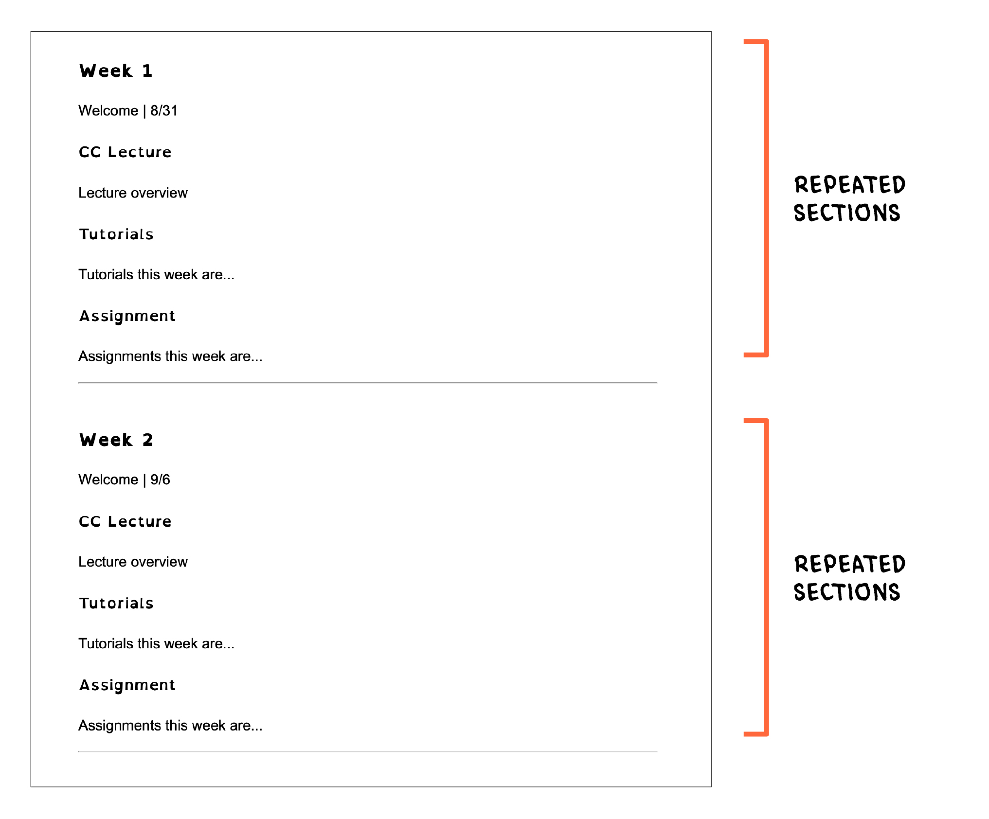
The schedule contains a set of elements which are repeated every week. The hierarchy created through the header tags will make it easy to navigate through the page. A horizontal line is used to visually differentiate each week with the <hr> tag. Screen readers will read this line as a ‘horizontal separator’, so be careful when using this line as a decorative element rather than a semantic separator. To hide decorative elements such as this line from the screen reader, include the tag aria-hidden=“true" within the element.
<hr aria-hidden=“true">
Assignments
The assignments page is similar in nature to the Schedule, with repeating blocks of content on the page separated by a horizontal line. These sections could contain links, images, videos, iframe embeds and a variety of other content.
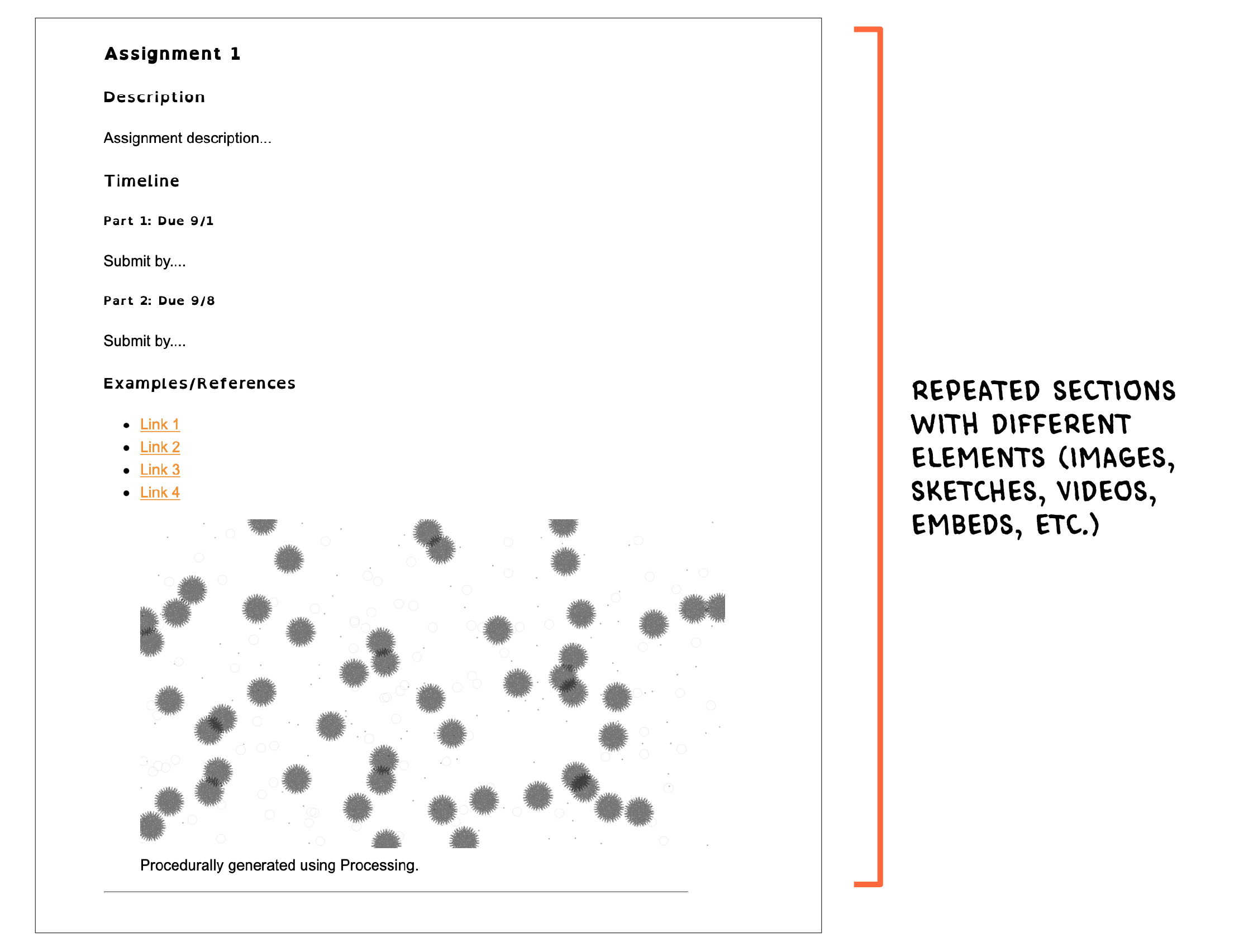
There are a few ways of presenting images on a webpage. One way is to use a <img> tag along with the appropriate alt=“image description” attribute.
    <img src="https://cdn.glitch.me/801e6f02-1a9e-41ff-b45b-8179b2a2c79f%2Fframes-015.png?v=1637260837236"
    alt="image which shows a procedurally generated image using processing, it contains a grey circles and hairy shapes sparsely spread out over a white background”>
Another way is to use <figure> and <figcaption> tags to present images, tables, or any other kind of content. Although HTML has these tags in order to group a visual and caption together, it doesn’t replace the alt tag.
    <figure>
      <img src="https://cdn.glitch.me/801e6f02-1a9e-41ff-b45b-8179b2a2c79f%2Fframes-015.png?v=1637260837236"
      alt="image which shows a procedurally generated image using processing, it contains a grey circles and hairy shapes sparsely spread out over a white background">
      <figcaption>Procedurally generated using Processing.</figcaption>
    </figure>
Different assistive technologies differ in their approach toward parsing the tags, hence testing the website across platforms is valuable. Here's a nice article which explains this in further detail
When it comes to embeds, it can get a little tricky depending on the nature of content embedded on the page. Some embeds can be tricky to navigate through as they may contain confusing elements. Embedded content should always be accompanied by a link taking the user directly to the content on the platform on which it is hosted, such as Youtube, p5js Editor, Sketchfab and others.
Additional Reading
- A11y & Me: A great resource with links to many more resources
- MDN Web Docs: Mozilla's guide to web accessibility
- Alt Text as Poetry: All about alt-text and more
- Penn State Accessibility: Penn State University's guide to web accessibility
- British Dyslexia Association: Read more about accessible friendly typefaces
- WebAim: Readings and tools to check web accessibility features
- W3C WCAG: Official guides and rules for web accessibility
- Magenta11y: Learn how to test your website using accessibility software
About
This project was created with the intent of making accessible websites for educators. However, this template and guide is also useful for those looking to learn how to create accessible websites. This is not a detailed guide, and is not intended to be.
Media Arts A11y is led by Xin Xin, an interdisciplinary artist, designer, and organizer currently making socially-engaged software that explores the possibilities of reshaping language and power relations. They are an Assistant Professor of Interaction and Media Design at Parsons School of Design.
The template is created by Salil Parekh, a design researcher and creative technologist, and a MFA Design and Technology student at The New School.
Please feel free to get in touch with us [e-mail]! We'd love to hear your feedback and learn how we can make this project better.
The GitHub repository is open and looking for pull requests! Media Arts A11y is released under the GNU GPL v3.0 license.
Special Thanks
The project would not exist without the help of certain people who helped with the design and development: Claire Kearney-Volpe, Shannon Finnegan, Chandler McWilliams, and Kate Hollenbach. x